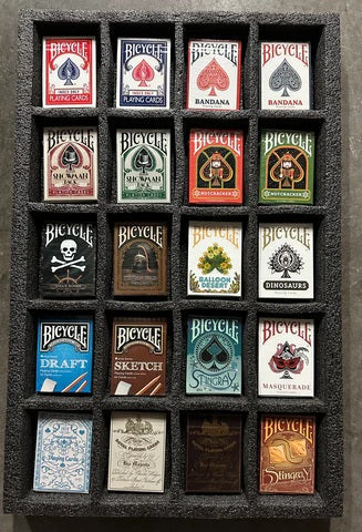
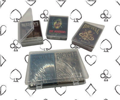
Rules & Tips To Improve Your Playing Card Photos
by Steve Rosenfield
Let’s be honest, everyone is a “photographer” these days. Social media has made it very easy for people to get their images out there and be more “creative” in whatever they do. Which is a good thing, right?
I’ve been a professional photographer for about 12 years now and although new filters have made it easier to create appealing photos, there are some things that filters don’t fix. The basics.
The rules of photography.
Even when it comes to photographing playing cards, there are rules involved.
Yes, like any other profession there are do’s and don’ts in the photography world. Believe it or not, you can usually tell a professional photographer from someone with a camera just taking photos. Don’t get me wrong, there are a lot of people who can take pretty good shots and they have no idea about what’s right and what’s wrong in their photos.
Before moving forward, I’m hoping you understand the 3 elements of exposure. If not, that’s the rule before the rules. Learn the ins and outs and turn that dial to M.
So let’s get into it. Remember these are brief examples as it’s up to you to research more into these rules. (There is always exceptions to the rules)
Rule 1 – Follow the rule of thirds. (for the most part) The rule of thirds is a guideline which applies to how we compose our shots. Following the rule of thirds WILL make your images more appealing to the eye. If you don’t know it, learn it.

Rule 2 – Focus on your subject. If you have too much going on in your image and it distracts the viewer from what you want them to focus on, crop it. Create a new image that makes your subject the main focus.

(Above: Correct / Below: Incorrect)

Rule 3 – Don’t cut off limbs. If you’re taking portraits and you shoot the subject below the elbow, show their hands. If you shoot them below the knee, show their feet. Never crop an image where half the hand or half the foot is missing. Same goes for animals, and playing cards. =)

(Above: Correct / Below: Incorrect)

Rule 4 – Straighten your images. If you take a picture that has lines that dictate the image, such as a door jam, the sea line, horizon etc, straighten it.

(Above: Correct / Below: Incorrect)

Rule 5 – Draw the viewer into the center. If you’re creating a collage or even composing an image, you want to draw the eyes into the center of the image, not outward.
Rule 6 – Pay attention to the background. Make sure there aren’t any trees or telephone poles coming out of your subject’s head. For example, if you’re shooting a black deck of cards and there’s a lime green hoody in the picture, chances are, the focus will be drawn to the lime green hoody. Re-compose the image so the deck is the highlight.

(Above: Correct / Below: Incorrect)

Rule 7 – Be in focus. Make sure your subject is in focus. If not, don’t use it. (unless the image works or is intended to be blurry) Someone doing a spring would work if their hands or body is in focus.

(Above: Correct / Below: Incorrect)

Rule 8 – Use depth. It will always be more appealing to have a foreground, middle and background. Use those plains efficiently. Colors, objects and subject all effect the image as a whole.
Rule 9 – Make sense. Pictures tell stories. If your image doesn’t make sense to the story you’re trying to tell, the image will not have impact to the viewer.

(Incorrect Example Above)
Rule 10 – Learn to edit/process images CORRECTLY. Yes, there is a correct way to process an image. Knowing how to do so, will separate a good photographer from a very good photographer.
This is a bonus rule. Stop taking pictures on train tracks and stop doing selective coloring. Oh, how could I forget? No decks of cards and flower bushes.
Whether you’re taking pictures of people, landscape or playing cards, these rules will help you better your game. If you want to follow some photographers I find great in the magic/cardistry world, I’ll list them below. As well as mine of course. =)
- @nothing_only_cards
- @alexpandrea
- @chrisramsay52
- @andreijikh
- @petermckinnon
- @theory11
- @patrickkun
- @iammrcup
- @kiergomes
- @thegentlemanwake
- @playingcardsphotographer
- @jtplayingcards
- @organic_playing_cards
- @nicolasnargeot
Good luck!! I’d love to meet and chat with cool people in the community. Reach out to me on Instagram. – Steve @nothing_only_cards
Photos that I find good on the site are listed below:
About the author: Steve’s a well-known photographer from Boston, MA, now living in the Bay Area of California. He’s been internationally published and his images have been used for posters, social media content, and album covers. Recently his work was used for The Chainsmokers’ 4x Platinum album Roses.
His work is intimate, and brings people into the lives of others in a mindful and conscious way.
His mission is to create change and explore vulnerability.
He always wants people to live their truth and be fearless in showing themselves just the way they are. Steve’s images are inspiring and thought provoking. Each image tells an important story in our journey to live the best life we can.
Steve’s work with his What I Be Project has been featured all over the world from pages like Yahoo, Huffington Post, The Guardian, UpWorthy, ABC News, BuzzFeed and many more. Huffington Post featured his work as the #1 top story in 2014.
He recently got into magic/cardistry about 4 months ago and has loved connecting and learning from so many cool people.

Last update date: 08/10/19


