- Home
- Superfly Spitfire Playing Cards USPCC
Superfly Spitfire Playing Cards USPCC
Share
Superfly Spitfire Playing Cards USPCC
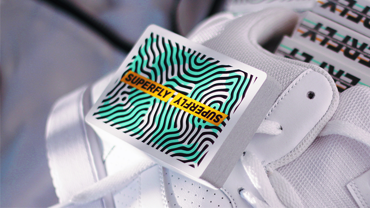
Superfly Spitfire is the third playing card deck from the popular Superfly Series. It features a very unique and eye-catching Spitfire pattern designed by Toomas Pintson. This pattern really radiates during cardistry moves!
The deck includes two awesome Jokers and two ad cards.
Printed on soft crushed stock.
Manufactured by The United States Playing Card Company.
Limited edition of 2500 decks.
2018 Release
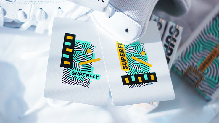
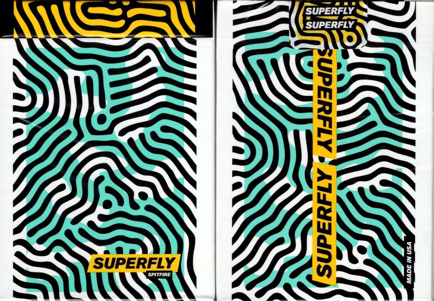
This deck follows the Superfly and Superfly Stardust decks, which were inspired by modern streetwear, fashion, and culture. The three main colours are a vibrant teal-green, yellow, and black. The main design on the box and card backs reminds me of a finger-print.
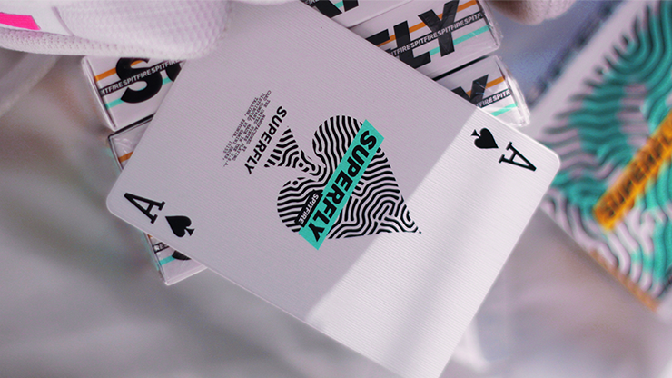
This deck has a feature not common in playing cards: name branding. The Superfly name is draped vertically across the length of the card, and is used both as an artistic addition, as well as giving the brand added visibility.
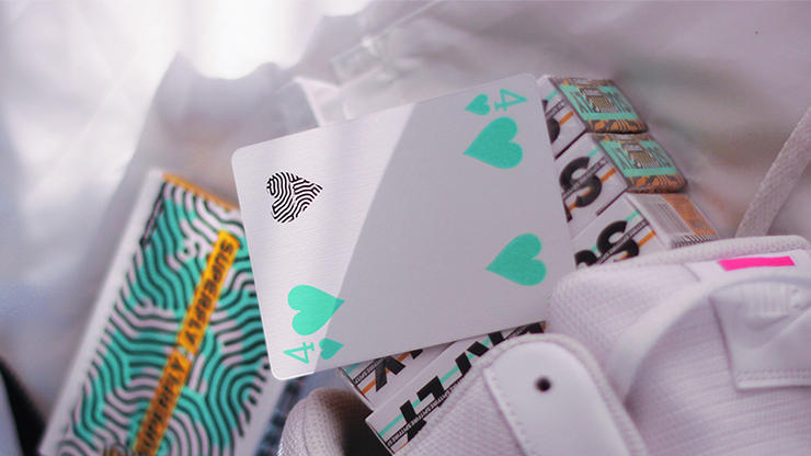
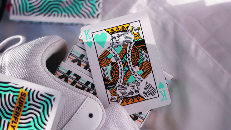
The deliberate name branding also has been applied to the face cards, all of which have an urban streetwear style look. The Superfly name is emblazoned very conspicuously on each court card. In addition, each card has one pip that picks up the finger-print style design of the card backs.
The choice of thin-crush USPCC stock leaves little doubt in my mind that this deck was created for cardists first of all, and it's a very original and fresh design.
Recently viewed products
This deck follows the Superfly and Superfly Stardust decks, which were inspired by modern streetwear, fashion, and culture. The three main colours are a vibrant teal-green, yellow, and black. The main design on the box and card backs reminds me of a finger-print.
This deck has a feature not common in playing cards: name branding. The Superfly name is draped vertically across the length of the card, and is used both as an artistic addition, as well as giving the brand added visibility.
The deliberate name branding also has been applied to the face cards, all of which have an urban streetwear style look. The Superfly name is emblazoned very conspicuously on each court card. In addition, each card has one pip that picks up the finger-print style design of the card backs.
The choice of thin-crush USPCC stock leaves little doubt in my mind that this deck was created for cardists first of all, and it's a very original and fresh design.