- Home
- Koi v2 Playing Cards USPCC
Koi v2 Playing Cards USPCC
Share
Koi v2 Playing Cards USPCC
Koi v2 Playing Cards
KOI Playing Cards celebrates the Koi fish -- a symbol of luck, prosperity, and good fortune in Japan.
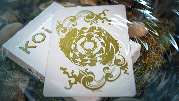
The beautiful, eye-catching back design poses two Koi fish in a circular, swimming motion with metallic gold as they glitter against the stark white background. The smooth, even feel of the cards are inspired by the scales of these majestic fish.
In Japanese, koi is a homophone for another word that means "affection" or "love", so koi are also symbols of love and friendship in Japan.
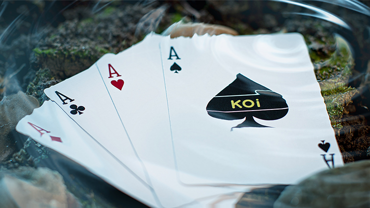
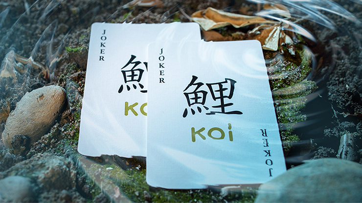
Includes 2 custom Koi Jokers and 2 gaffed cards.
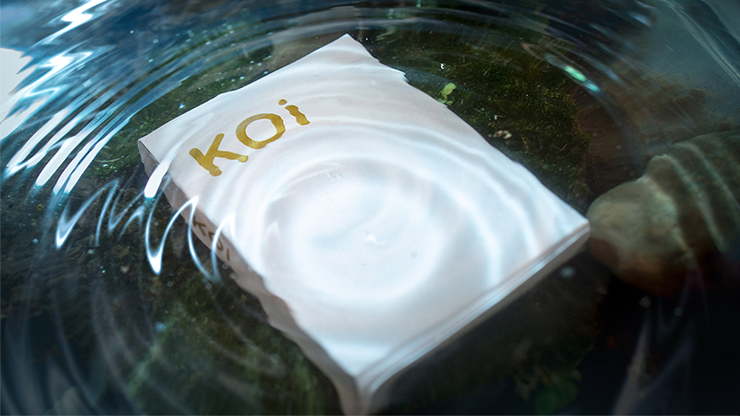
- Gold embossed tuck
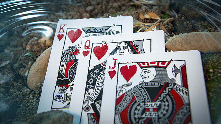
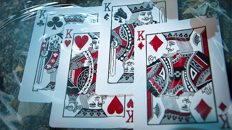
- Specially colored Court cards
- Printed by the U.S. Playing Card Company
- Designed by Byron Leung
- 2019 Release
This deck was on sale so I picked it up. The color on the card back is just a bit off for me. Just not in on the glittery gold look.
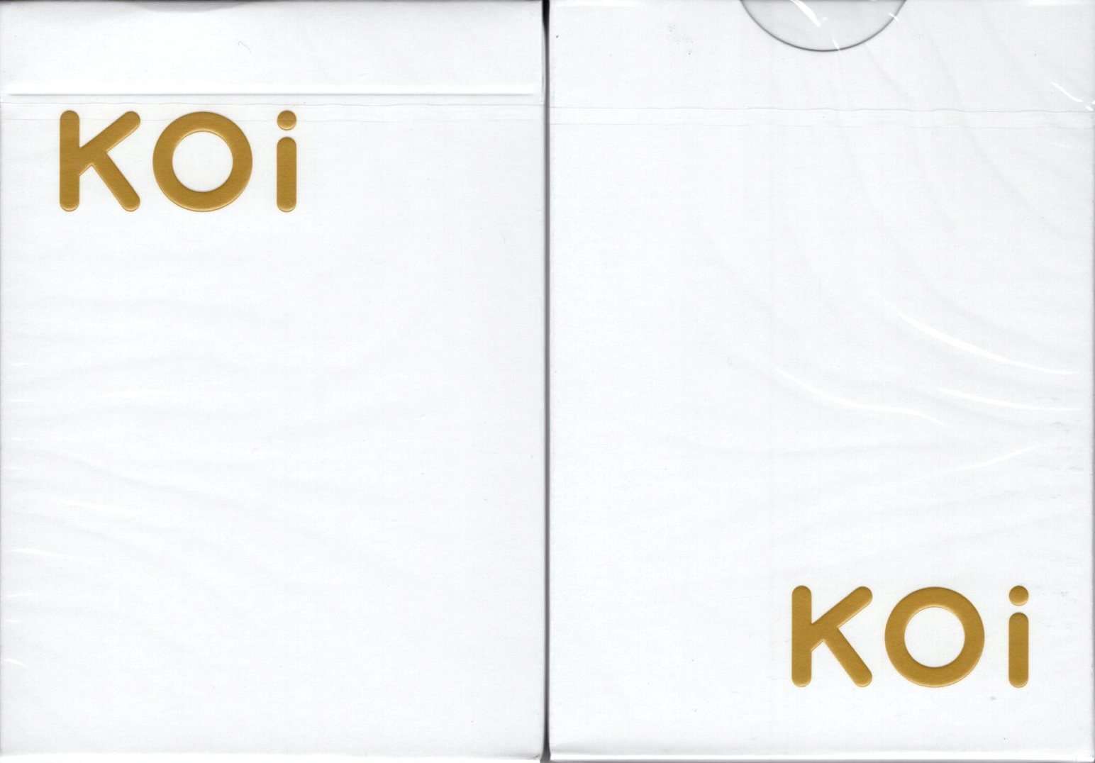
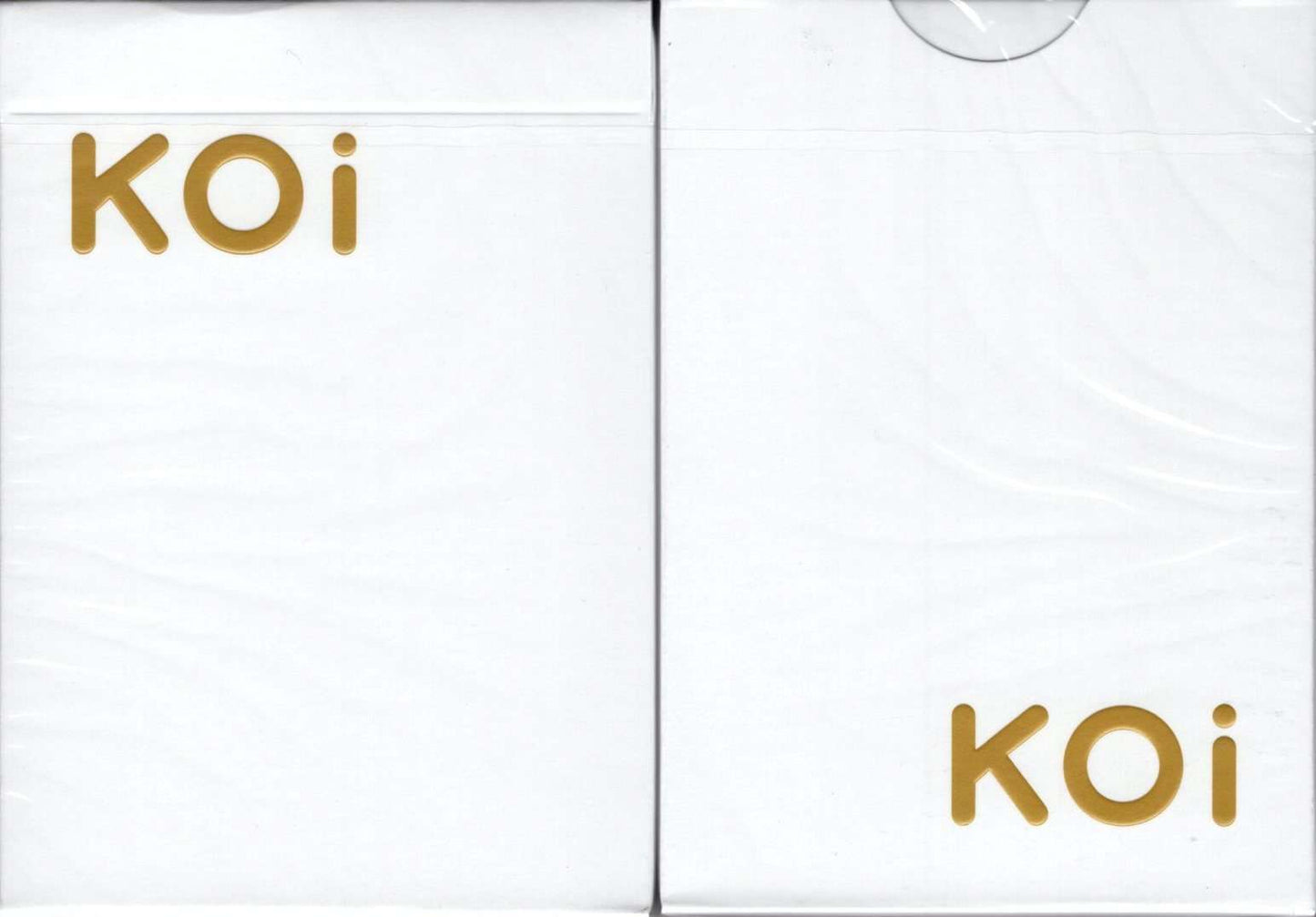
This is a more luxurious version of the original Koi deck by Byron Leung. The more classy look begins with a very simple white tuck box, adorned only with the word Koi in a raised and gold font. The design on the card-backs is clearly inherited from the first version of the deck, but instead of a white design on a red background we now have a metallic gold design on a white background, for a much more sophisticated look.
Byron's original vision was to create an Oriental deck that actually looked and felt Asian, hence the Koi fish design which also has some coiled up snakes in the center, to reflect the fact that he was born in the Chinese Year of the Snake, and some water waves on the outside to reflect his calm and patient personality. It's a solid standard deck, and if you appreciate the glittering and swirling fish on the card backs, you'll find a lot to like here.
Recently viewed products
This deck was on sale so I picked it up. The color on the card back is just a bit off for me. Just not in on the glittery gold look.
This is a more luxurious version of the original Koi deck by Byron Leung. The more classy look begins with a very simple white tuck box, adorned only with the word Koi in a raised and gold font. The design on the card-backs is clearly inherited from the first version of the deck, but instead of a white design on a red background we now have a metallic gold design on a white background, for a much more sophisticated look.
Byron's original vision was to create an Oriental deck that actually looked and felt Asian, hence the Koi fish design which also has some coiled up snakes in the center, to reflect the fact that he was born in the Chinese Year of the Snake, and some water waves on the outside to reflect his calm and patient personality. It's a solid standard deck, and if you appreciate the glittering and swirling fish on the card backs, you'll find a lot to like here.