- Home
- Imperial Blue Bicycle Playing Cards
Imperial Blue Bicycle Playing Cards
Share
Imperial Blue Bicycle Playing Cards
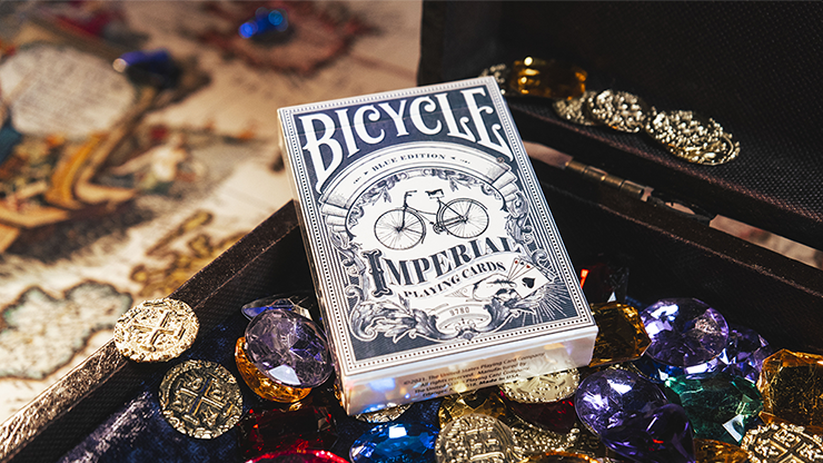
Introducing Imperial Playing Cards.
A tribute to Imperial Bicycles...and aptly Bicycle branded.
What the bicycle did to transportation, the Bicycle brand did to magic.
Nothing has been more impactful on the transportation industry as the bicycle. The masses were mobile. They could come and go as needed without horses or carriages. The riches of the world were waiting to be uncovered.
Much like the Bicycle brand transformed magic. Providing quality and a standard of excellence to magicians, designers, collectors and cardists. Freeing the mind and their fingers to create whatever they could envision.
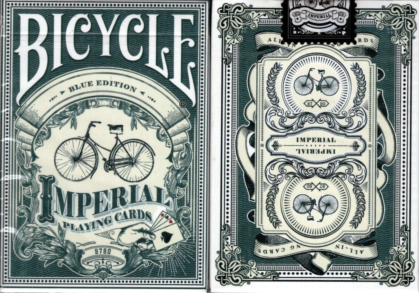
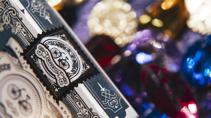
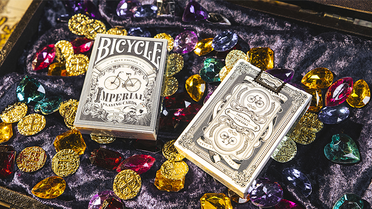
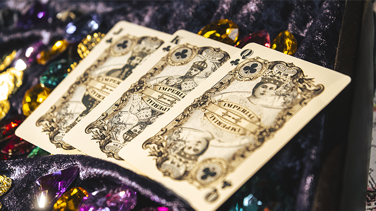
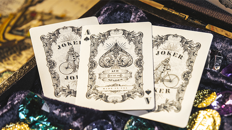
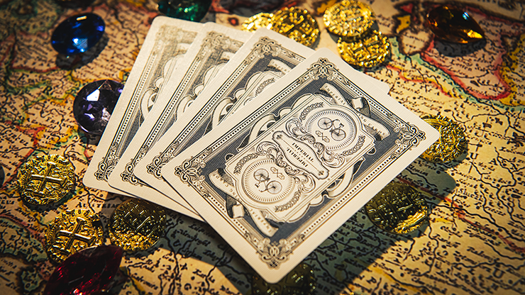
Imperial Playing Cards have custom artwork throughout the entire deck. Everything. Intricate tuck. Custom two way back design. Elaborate vintage drawings on the court cards, Aces, Jokers...EVERY card. Even the pips and indices uniquely define the Imperial deck.
Conquer the world.
- Bicycle Branded
- Made in the USA by the US Playing Card Company
- Completely custom deck. Everything (pips, backs, court cards, tuck...)
- Two way back design
- Custom seal
- Includes double back and blank face gaff cards
2022 Release
Great deck.
Easily one of my favorite Bicycle branded decks. The court cards of this deck are fantastic in their design and the art was done to perfection.
Aside from the text printing error in the wavy banner on the back of the cards, this is an excellent deck of playing cards. I look at that as a minor faux pax and nothing detract from the beauty of this design. It's sort of like the U.S. Air Mail stamp with the plane printed up-side-down. The stamp still worked, and so will these cards.
I am a fan of this style that looks as though the deck was printed using engraving plates. The detail is extremely fine. What IS a delightful surprise, unlike most decks, is that same detail is carried forth to the court cards and the aces as well. I like the fact that these card are printed on off-white stock which complements the olive green ink. If you like fine-line detail, these cards are for you.
Cool deck except for the mistake on the back of the deck. In the wavy banner it says Imperial Playing Cards but the wave of the type does not match the wave of the banner. If you move the top line down to the bottom banner and the bottom type up to the top banner then the waves would match. Surprised this was not caught prior to printing. The graphic designer in me caught this immediately.
Recently viewed products
Great deck.
Easily one of my favorite Bicycle branded decks. The court cards of this deck are fantastic in their design and the art was done to perfection.
Aside from the text printing error in the wavy banner on the back of the cards, this is an excellent deck of playing cards. I look at that as a minor faux pax and nothing detract from the beauty of this design. It's sort of like the U.S. Air Mail stamp with the plane printed up-side-down. The stamp still worked, and so will these cards.
I am a fan of this style that looks as though the deck was printed using engraving plates. The detail is extremely fine. What IS a delightful surprise, unlike most decks, is that same detail is carried forth to the court cards and the aces as well. I like the fact that these card are printed on off-white stock which complements the olive green ink. If you like fine-line detail, these cards are for you.
Cool deck except for the mistake on the back of the deck. In the wavy banner it says Imperial Playing Cards but the wave of the type does not match the wave of the banner. If you move the top line down to the bottom banner and the bottom type up to the top banner then the waves would match. Surprised this was not caught prior to printing. The graphic designer in me caught this immediately.