Skip to product information

Fire Elements Series Bicycle Playing Cards

$5.99 USD
 per 
10 in stock!
View full details

Fire Elements Series Bicycle Playing Cards

$5.99 USD
 per 

Fire Elements Series Bicycle Playing Cards

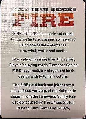
The first deck in the Elements series that will be rolling out over the next four years, Bicycle Fire playing cards are a showstopper with hues of red, orange, and black smoldering chars.

Updated from the very collectible Hobgoblin card back design printed on the renowned Vanity Fair deck produced by The United States Playing Card Company in 1895.
 
Features:
  • Faces are a retake on the classic, reset with the court cards wearing fiery garments of reds and oranges
  • Printed on premium Bicycle brand cardstock
  • Classic Air-Cushion Finish® for ease of shuffling and optimum performance
  • Made in the USA
  • 2017 Release

Customer Reviews

Based on 14 reviews
57%
(8)
29%
(4)
0%
(0)
14%
(2)
0%
(0)
D
DT
Great Deck

I bought this deck on a whim. I thought it would be a different from the Ryder Back decks I use for magic tricks. After getting the deck and using it, I discovered that it has a built-in marking on the back that allows for an easy, self-working card trick.

C
Cody

Cool deck.

c
chris clark
fire in the hole

A very sexy deck. You had me at hobgoblin, but I love the gorgeous backs on these fine cards. Get some!

D
Deck Me in the Face
Blowing Smoke

They feel and handle great or as expected from standard USPCC card stock.

The tuck case is the cheapest looking of the Bicycle decks I've seen. I don't understand the western Wanted poster font on the front. Why not something a little more fiery?

The Hobgoblin inspired backs are a great design. Unfortunately, the smoky colored ink doesn't pop the best on the fire-infested backs. The ace of spaces is actually lit though. It's as depicted on the front, but it's cheapened by that ugly, blocky font.

The backs are not symmetrical. My impression is that this is to give them a bit more of an erratic look like flames in a fire. But it just makes them look a whole mess. The edges on these started to chip almost immediately. The red pips are actually "fire" orange. If you Google "shades of orange," they're the one called, literally, "fire."

The best part of this deck is the face cards. They have this great color combination of muted dark green and burnt orange. Haven't found anything with this unique, but palatable, color scheme on face cards. The jokers are an excellent edition -- playful, appear to be hand-drawn.

J
Josh
Idea is FIRE, execution needs help.

So I love the idea of the element series, but I feel like this is just a color swap and more could have been done. The backs are one way (which I don't like) and printed all the way to the edge, looks cool in a fan but wont last. The cards fronts are orange and black instead of the usual red and black. Again I feel this is a miss because its JUST a color change, why not make the orange have little flames and the blacks look charred? Its fire right? the face cards have the same burnt orange look and the jokers have little fire imps but that's about it. wished for more out of these.

Recently viewed products

Customer Reviews

Based on 14 reviews
57%
(8)
29%
(4)
0%
(0)
14%
(2)
0%
(0)
D
DT
Great Deck

I bought this deck on a whim. I thought it would be a different from the Ryder Back decks I use for magic tricks. After getting the deck and using it, I discovered that it has a built-in marking on the back that allows for an easy, self-working card trick.

C
Cody

Cool deck.

c
chris clark
fire in the hole

A very sexy deck. You had me at hobgoblin, but I love the gorgeous backs on these fine cards. Get some!

D
Deck Me in the Face
Blowing Smoke

They feel and handle great or as expected from standard USPCC card stock.

The tuck case is the cheapest looking of the Bicycle decks I've seen. I don't understand the western Wanted poster font on the front. Why not something a little more fiery?

The Hobgoblin inspired backs are a great design. Unfortunately, the smoky colored ink doesn't pop the best on the fire-infested backs. The ace of spaces is actually lit though. It's as depicted on the front, but it's cheapened by that ugly, blocky font.

The backs are not symmetrical. My impression is that this is to give them a bit more of an erratic look like flames in a fire. But it just makes them look a whole mess. The edges on these started to chip almost immediately. The red pips are actually "fire" orange. If you Google "shades of orange," they're the one called, literally, "fire."

The best part of this deck is the face cards. They have this great color combination of muted dark green and burnt orange. Haven't found anything with this unique, but palatable, color scheme on face cards. The jokers are an excellent edition -- playful, appear to be hand-drawn.

J
Josh
Idea is FIRE, execution needs help.

So I love the idea of the element series, but I feel like this is just a color swap and more could have been done. The backs are one way (which I don't like) and printed all the way to the edge, looks cool in a fan but wont last. The cards fronts are orange and black instead of the usual red and black. Again I feel this is a miss because its JUST a color change, why not make the orange have little flames and the blacks look charred? Its fire right? the face cards have the same burnt orange look and the jokers have little fire imps but that's about it. wished for more out of these.