- Home
- Encarded v1 Playing Cards EPCC
Encarded v1 Playing Cards EPCC
Share
Encarded v1 Playing Cards EPCC
Encarded v1 Playing Cards
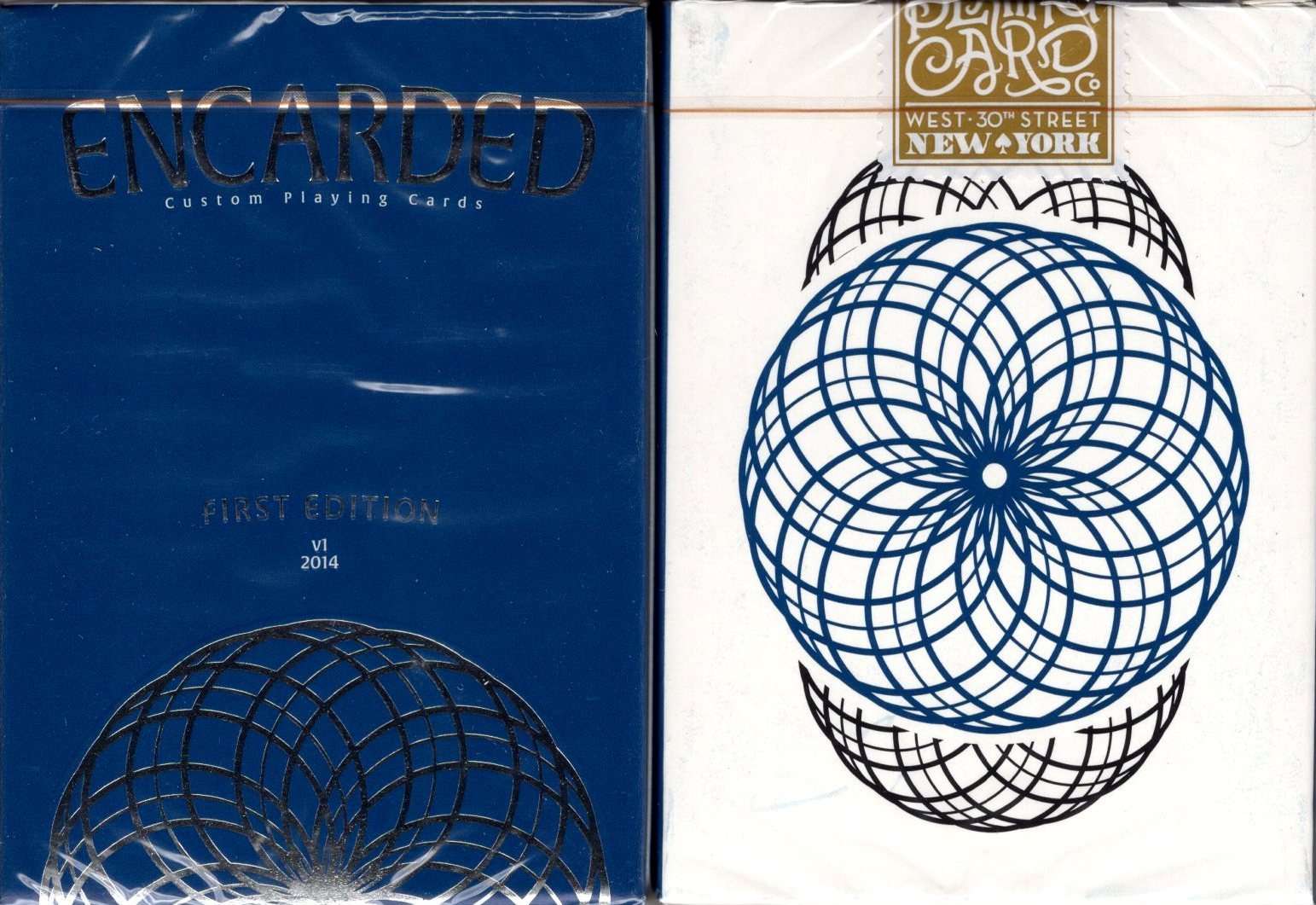
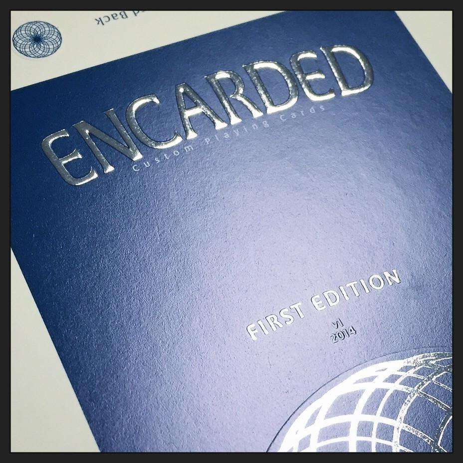
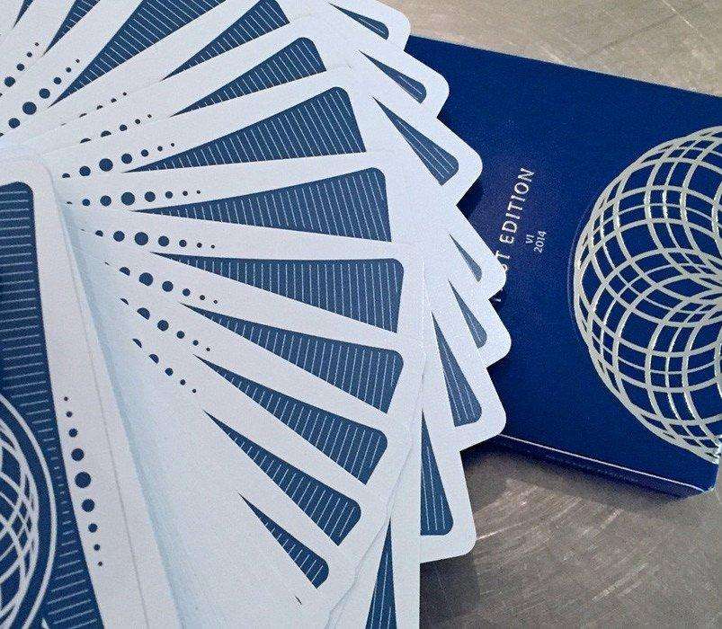
The First Edition of the Encarded Standard deck features a metallic blue back and a 70's vintage-inspired, top loading tuck box with silver foil and embossing details.
Printed by the Expert Playing Card Company (the same printer as the amazing Zenith deck), the Standards feature the perfect borders, smooth edges and amazing handling customary to every EPCC deck.
This first edition is a small run, with less than 200 decks are still available from Encarded.
Once this First Edition sells out, we will design an entirely new box and release a new deck color so that we always have an affordable and usable deck in stock. This classic blue will always be the first, so be sure to get some of this limited run while you can!
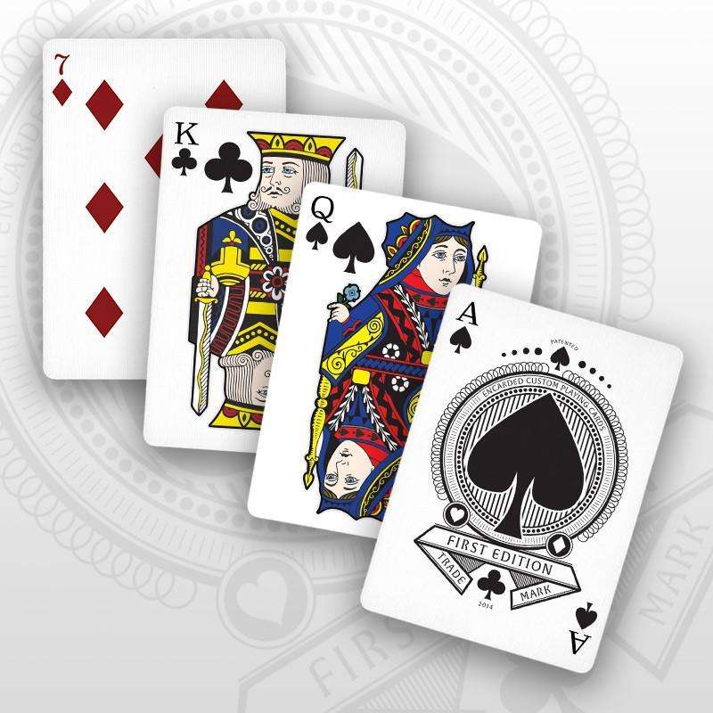
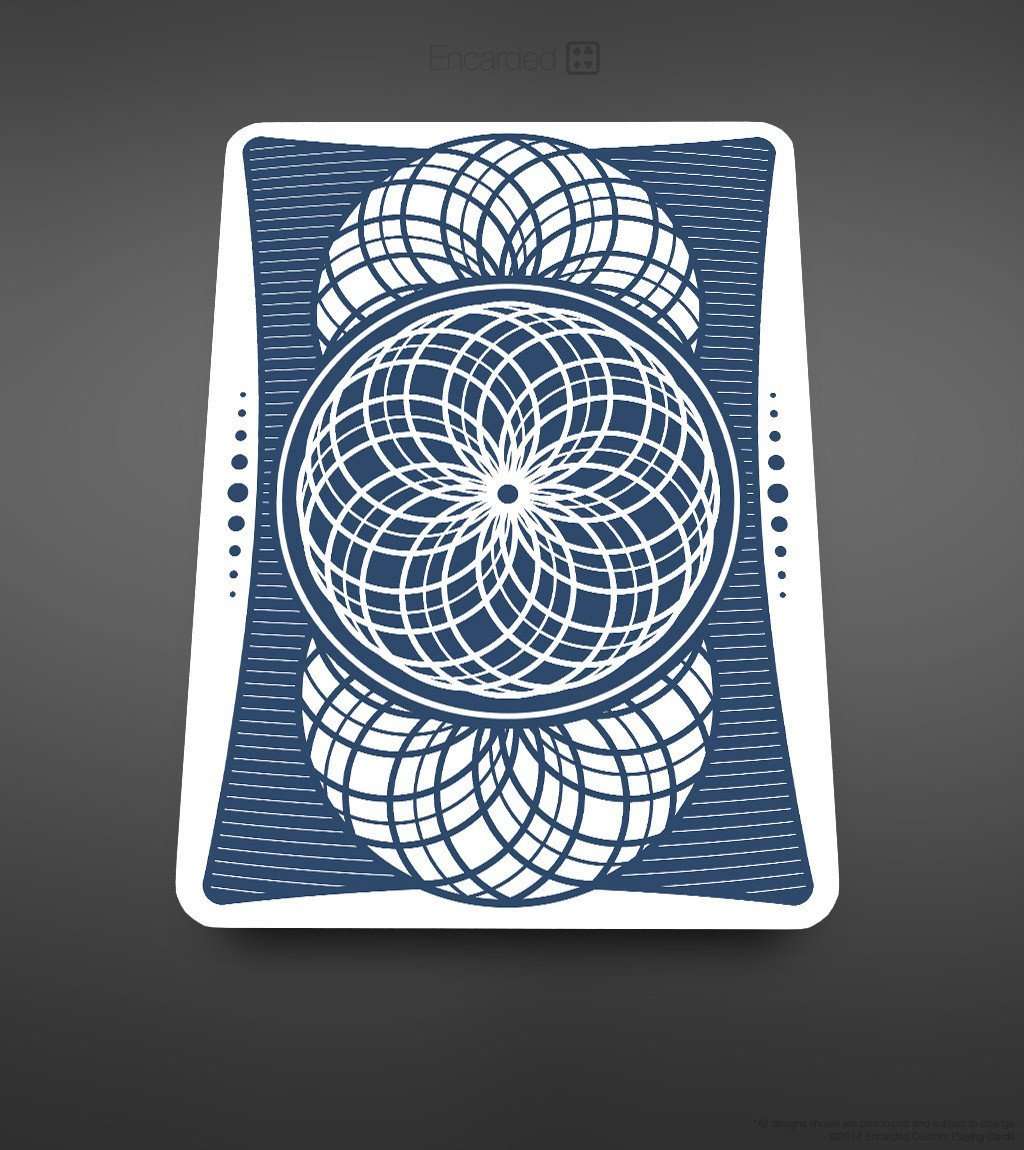
This is a very nice looking deck. The cardback design is a nice change from the rectangular bordered and full-bleed backs. The card faces have a unique for for the pips, and the court cards are colorful in their redesign, while retaining artistic cues to the standard designs (think watching a REALLY good remake of a classic movie)
The only knock here is the feel. The cards feel slick, like running your fingers over a teflon surface. This struck me as off-putting (not necessarily bad, just... different). I can see handling these cards with very dry hands might feel tricky, with the texture being so subtle as to not allow you traction. If intending for game night, again, the change in feel might be noticed by players used to the way cards normally feel.
With the affordability of this deck, though, I suggest getting them and seeing for yourself, you may like the handling, and if not, you still have a great looking deck!
This deck from Paul Carpenter is intended to be affordable and usable. The court cards are styled on classic faces, but with a completely reworked and custom look - they have a vibrant and playful feel that helps raise this deck above average. The pips on all cards are customized too, but beside the courts the overall look is easily recognizable and functional.
The box has a neat clean look, and silver foil and subtle embossed features adds elegance, while the back has a patterned design not unlike the card-backs, but with inverted colours.
These cards were printed by the EPCC in their Master finish, and they are thinner and snappier than a typical USPCC produced deck; they feel quite different, but are more durable, and handle well. Good practical deck.
Recently viewed products
This is a very nice looking deck. The cardback design is a nice change from the rectangular bordered and full-bleed backs. The card faces have a unique for for the pips, and the court cards are colorful in their redesign, while retaining artistic cues to the standard designs (think watching a REALLY good remake of a classic movie)
The only knock here is the feel. The cards feel slick, like running your fingers over a teflon surface. This struck me as off-putting (not necessarily bad, just... different). I can see handling these cards with very dry hands might feel tricky, with the texture being so subtle as to not allow you traction. If intending for game night, again, the change in feel might be noticed by players used to the way cards normally feel.
With the affordability of this deck, though, I suggest getting them and seeing for yourself, you may like the handling, and if not, you still have a great looking deck!
This deck from Paul Carpenter is intended to be affordable and usable. The court cards are styled on classic faces, but with a completely reworked and custom look - they have a vibrant and playful feel that helps raise this deck above average. The pips on all cards are customized too, but beside the courts the overall look is easily recognizable and functional.
The box has a neat clean look, and silver foil and subtle embossed features adds elegance, while the back has a patterned design not unlike the card-backs, but with inverted colours.
These cards were printed by the EPCC in their Master finish, and they are thinner and snappier than a typical USPCC produced deck; they feel quite different, but are more durable, and handle well. Good practical deck.