- Home
- Dapper Orange Playing Cards EPCC
Dapper Orange Playing Cards EPCC
Share
Dapper Orange Playing Cards EPCC
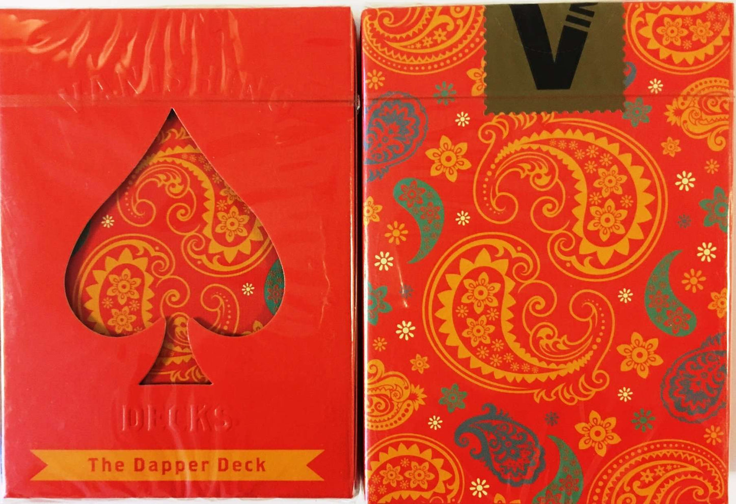
When Vanishing Inc. Magic set out to design its first deck of signature brand playing cards, they had one specific goal in mind: to create the most fashion-forward, subtle, and sophisticated "look" for a deck of cards yet devised. The result is the Dapper Deck, which is an attractive deck of cards crafted from the finest stock and finish. They are gorgeous and subtle, and appropriate for formal performances. Many decks are designed to be kept in the plastic, collected, and displayed. This deck was designed to be used.
This deck's colors are fantatic. Really a nice, dapper looking deck for sure. Love the back design. A must.
The stylish tuck boxes are custom designed with a spade-shaped cut-out that reveals the unique pattern on the card backs of both decks. The Orange deck is the most striking of the two, with its fiery orange colour; the Navy Blue deck is basically a matching deck, except that the card-backs feature navy blue as the dominant colour. I particularly love the vibrant colour and design of the card backs on both decks. This damask/paisley pattern is incorporated into a single pip on some of the number cards as well, and into the over-sized Aces - the Spades and Clubs use the colours of the blue deck, while the Hearts and Diamonds use the colours of the orange deck. The court cards have a colour scheme that matches the rest of the deck: yellow, red-orange, blue, and green. The colour of the red pips is more of an orange/red than a traditional deck, which complements the colour scheme of the main design. I'm a huge fan of the colours used by these decks, while htey are still very functional. The subtle marking system is very easy to read, and yet not at all obvious. The Classic finish from EPCC is comparable to the quality and handling of a USPCC produced deck.
Recently viewed products
This deck's colors are fantatic. Really a nice, dapper looking deck for sure. Love the back design. A must.
The stylish tuck boxes are custom designed with a spade-shaped cut-out that reveals the unique pattern on the card backs of both decks. The Orange deck is the most striking of the two, with its fiery orange colour; the Navy Blue deck is basically a matching deck, except that the card-backs feature navy blue as the dominant colour. I particularly love the vibrant colour and design of the card backs on both decks. This damask/paisley pattern is incorporated into a single pip on some of the number cards as well, and into the over-sized Aces - the Spades and Clubs use the colours of the blue deck, while the Hearts and Diamonds use the colours of the orange deck. The court cards have a colour scheme that matches the rest of the deck: yellow, red-orange, blue, and green. The colour of the red pips is more of an orange/red than a traditional deck, which complements the colour scheme of the main design. I'm a huge fan of the colours used by these decks, while htey are still very functional. The subtle marking system is very easy to read, and yet not at all obvious. The Classic finish from EPCC is comparable to the quality and handling of a USPCC produced deck.