- Home
- Cherry Casino Tahoe Blue – The Collector’s Favorite in a Timeless Series
Cherry Casino Tahoe Blue – The Collector’s Favorite in a Timeless Series
Share
Cherry Casino Tahoe Blue – The Collector’s Favorite in a Timeless Series
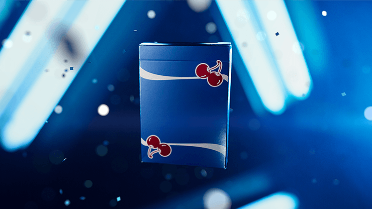
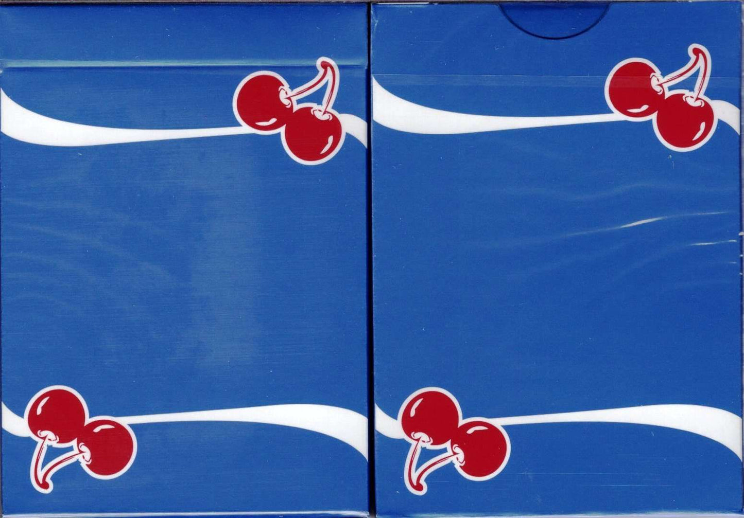
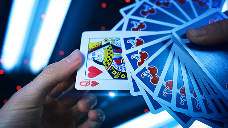
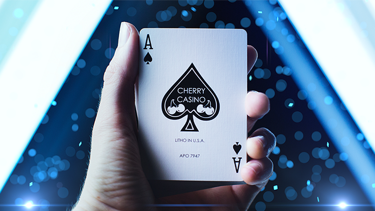
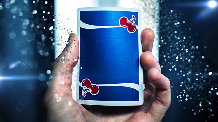
The captivating Cherry Casino Tahoe Blue Playing Cards invite you to experience the refreshing feel of thin card stock that handles effortlessly. Inspired by the allure of Lake Tahoe’s clear waters and old-time casinos, this deck exudes the mystique and charm of vintage Las Vegas. Designed by Sam Devins and Derek McKee, it’s a must-have for magicians, cardists, and collectors worldwide. Featuring custom court cards, Ace of Spades, Jokers, and 2 gaff cards, this 2018 release continues to be the most sought-after in the Cherry Casino series.
These are my new faves. I really enjoy the thin stock and smooth feel of this deck. As an amateur card magician, the retro casino look doesn’t seem to call any unnecessary attention to the deck. Folks just think you have a souvenir deck. The Tahoe Blue is similar to a gunmetal blue with a pearl finish that really adds to the retro feel. Identical jokers, blank face, & double backer - can’t go wrong. Is it possible that I have time traveled? I see more of these decks in my future.
I think the color on the Cherry Casino Tahoe Blue Playing cards printed by the United States Playing Card Company is awesome. I would highly recommend them for any collection.
As the above description says, I absolutely can hear the flick and slide of cards on a felt. It gives me a thrill thinking of it, and this deck just fits so well into that niche of what you expect from casino cards.
These are some of the prettiest cards I've seen, in regards to the tuck and card backs. A subtle metallic ink is used, and the pale blue is very easy on the eyes. They're not flashy, but sometimes subtlety is what you need.
Its a beautiful deck with one of my favorite back designs. Honestly though the deck is too expensive for what it. It's got metallic ink which makes the deck look cool but the faces are all standard and the back isn't flashy.
But because of the standard faces and back design it makes this deck great to use for magic.
Recently viewed products
These are my new faves. I really enjoy the thin stock and smooth feel of this deck. As an amateur card magician, the retro casino look doesn’t seem to call any unnecessary attention to the deck. Folks just think you have a souvenir deck. The Tahoe Blue is similar to a gunmetal blue with a pearl finish that really adds to the retro feel. Identical jokers, blank face, & double backer - can’t go wrong. Is it possible that I have time traveled? I see more of these decks in my future.
I think the color on the Cherry Casino Tahoe Blue Playing cards printed by the United States Playing Card Company is awesome. I would highly recommend them for any collection.
As the above description says, I absolutely can hear the flick and slide of cards on a felt. It gives me a thrill thinking of it, and this deck just fits so well into that niche of what you expect from casino cards.
These are some of the prettiest cards I've seen, in regards to the tuck and card backs. A subtle metallic ink is used, and the pale blue is very easy on the eyes. They're not flashy, but sometimes subtlety is what you need.
Its a beautiful deck with one of my favorite back designs. Honestly though the deck is too expensive for what it. It's got metallic ink which makes the deck look cool but the faces are all standard and the back isn't flashy.
But because of the standard faces and back design it makes this deck great to use for magic.