- Home
- Cardistry Calligraphy Playing Cards - Blue & Red
Cardistry Calligraphy Playing Cards - Blue & Red
Share
Cardistry Calligraphy Playing Cards - Blue & Red
Sold as a set or individually
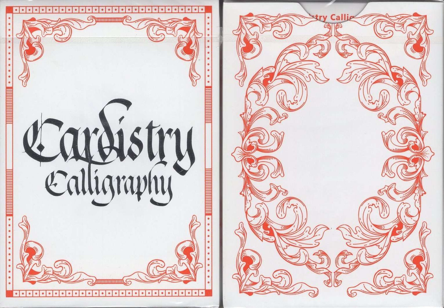
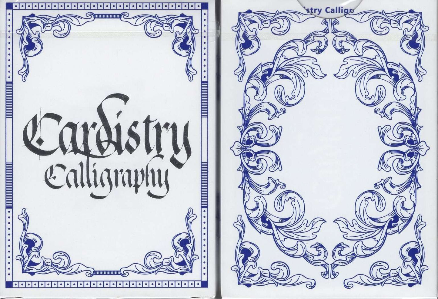
The first release of Cardistry Calligraphy at the 2017 Cardistry-Con in Los Angeles, quickly sold out at the conference. As its name suggests, it celebrates the beauty of calligraphy. In addition, this feature makes it the perfect choice for cardistry, as flourishes and other effects look elegant and eye-catching when using this deck.
BOMBMAGIC in collaboration with Ink Academy, the first international calligraphy school, has created a deck of cards in calligraphic style. This deck is great for conveying and continuing the distinct performance of card flourishing. Our hope is that Cardistry Calligraphy carries on the art and craft of "Cardistry", bringing the tradition further into the world and the future.
2017 Release
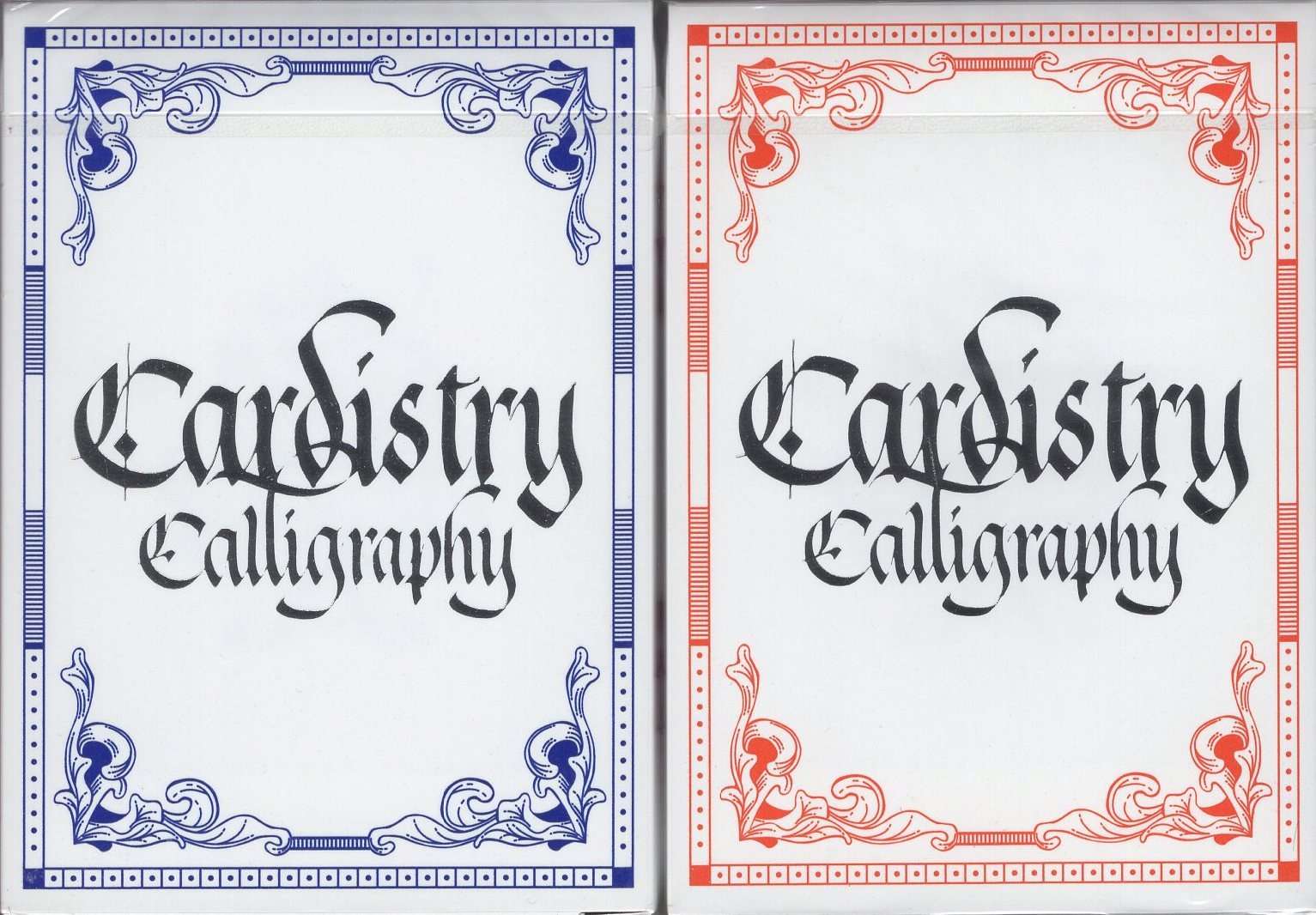
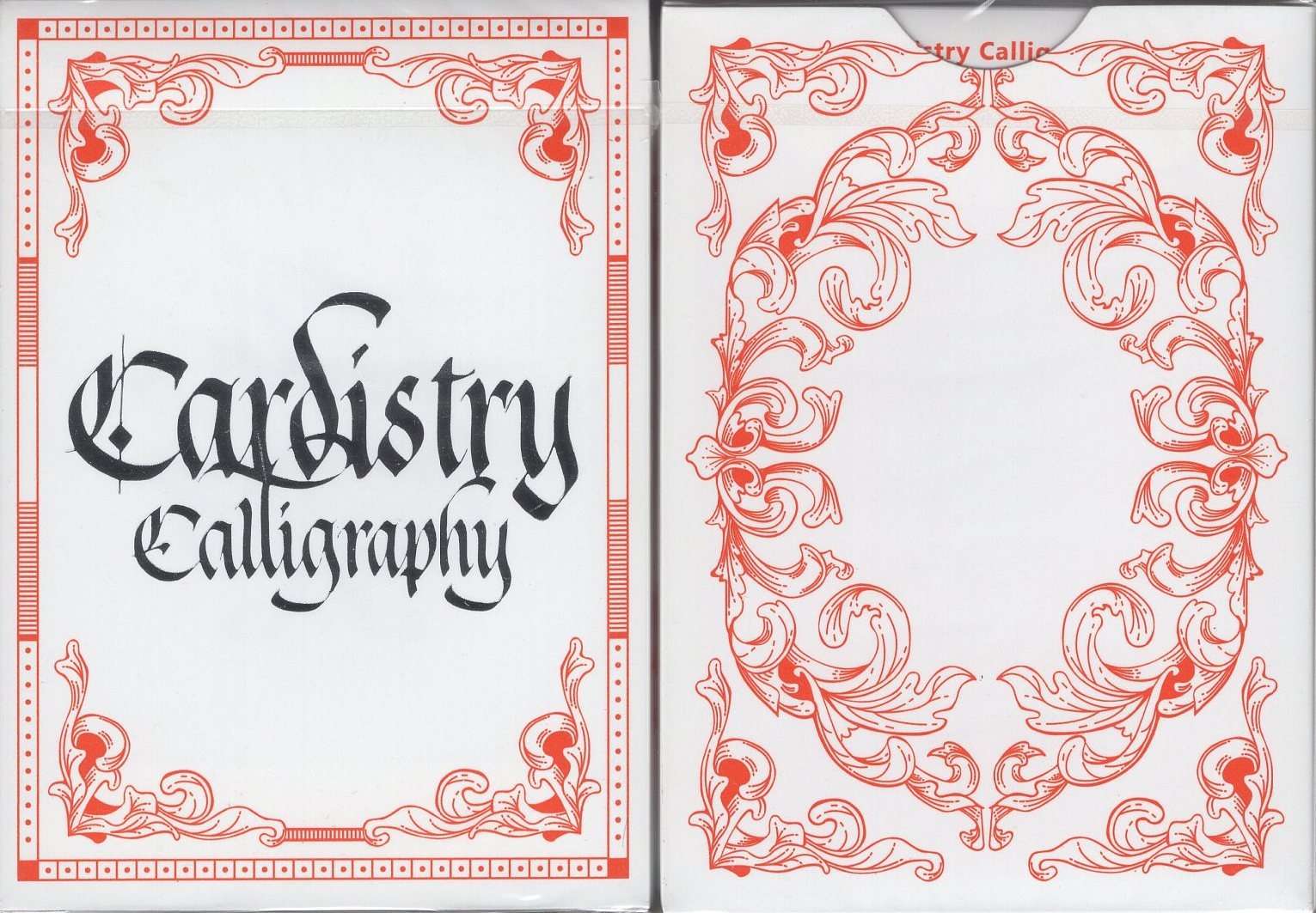
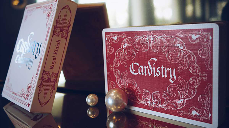
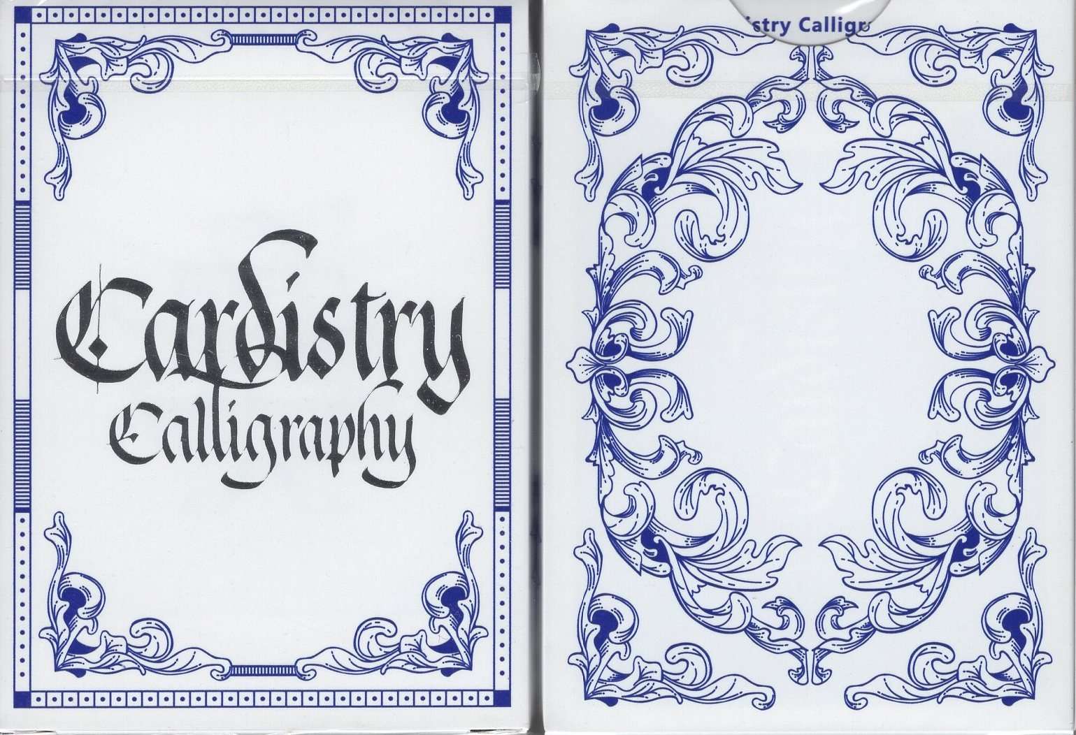
These decks were the result of a collaboration with the world's first international calligraphy school, Ink Academy. The graphic design of the boxes emphasizes the calligraphic lettering which gives the deck its name. The card backs have lovely and consistent narrow borders in white, which stands out beautifully against the solid blue that fills the majority of the landscape of the cards. The overall design is the same as what appears on the back of the tuck box, but with a reversed colour scheme. But there is one further change: the word Cardistry now appears in a stylish calligraphic font in the very center of the cards. This does mean that the cards have one-way backs. In keeping with the elegant lettering, ornate decorations with a floral design surround the border. The pips are over-sized, while the indices are small, and ideal for large spreads and fans of cards. The standout feature of the faces are the customized cards: the Aces, court cards, and Jokers - these just have a single large letter - K, Q or J - done with calligraphy. It's an ideal deck for cardistry, and handles nicely, but is not practical for games due to the unusual court cards.
Recently viewed products
These decks were the result of a collaboration with the world's first international calligraphy school, Ink Academy. The graphic design of the boxes emphasizes the calligraphic lettering which gives the deck its name. The card backs have lovely and consistent narrow borders in white, which stands out beautifully against the solid blue that fills the majority of the landscape of the cards. The overall design is the same as what appears on the back of the tuck box, but with a reversed colour scheme. But there is one further change: the word Cardistry now appears in a stylish calligraphic font in the very center of the cards. This does mean that the cards have one-way backs. In keeping with the elegant lettering, ornate decorations with a floral design surround the border. The pips are over-sized, while the indices are small, and ideal for large spreads and fans of cards. The standout feature of the faces are the customized cards: the Aces, court cards, and Jokers - these just have a single large letter - K, Q or J - done with calligraphy. It's an ideal deck for cardistry, and handles nicely, but is not practical for games due to the unusual court cards.