In the world of playing cards, there are many well-known brands and publishers. But there's also a number of well-known designers, many of whom have published their playing cards with multiple playing card manufacturers and under different labels. Arguably one of the most prolific is Randy Butterfield. So let's find out more about Randy and take a look at some of his work!
Who is Randy Butterfield?
Randy Butterfield might not be a name you've heard before. But if you enjoy playing cards, you have almost certainly come across his work. Randy has designed over 40 different decks, including several that have hit the mass market and been stocked by large retail stores in the United States.Randy's day job is a senior designer for a marketing company where his role is to create gift packs and displays for the wine and spirits industry. But at night, Randy burns the midnight oil doing something else: designing playing cards. The name of his company - Midnight Cards - is a nod to his habit as a night owl, because he spends his free time in the evenings to explore a different aspect of his creative side: making beautiful custom decks.
His background includes a degree in Fine Arts in Graphic Design. His initial experience in the workforce involved technical work in the pre-press department of a print shop, although already then he did some freelance designing on the side. But it was when he started working from home to design packaging for high profile clients at Motive Marketing, that he really began to have opportunity to work on personal projects and design playing cards at night.
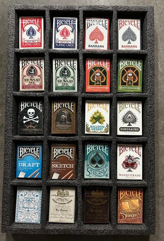
He launched his first deck, Ornate Playing Cards, back in 2012 for the House of Playing Cards, and hasn't looked back. Today there are more than 200,000 decks that have been printed with Randy's designs. That is a staggering number considering that many crowdfunded projects only print around 2000 copies of a deck! So let's check out a selection of Randy's creations, especially focusing on ones that are still readily available.
Ornate decks
The Ornate deck was Randy's first published deck, which he produced for the House of Playing Cards. It went on to become a very popular deck, and many consider it to be one of the best decks released in 2012.He later refined the original deck, and produced several different revised versions, mostly in different colours, including Sapphire, Scarlet, Amethyst, and Emerald. Altogether about 10,000 of the original Ornate decks were produced - a large amount for a custom deck in the world of playing cards.
Randy describes his Ornate deck as "playing cards fit for royalty", because they exude elegance and class, and are meticulously designed with an elaborate baroque theme and style. While watching an episode of The Tudors, he was struck by the elaborate and over-the-top details on all the furniture and other settings. This inspired him to apply this approach to a playing card design, by giving attention to ornate detail on the back design, borders, and background patterns.
The face cards of Amethyst deck feature a gray-black background for the spades and clubs, and a purple background for the hearts and diamonds. The Emerald deck features a green-gold colour scheme for the spades and clubs, and a silver-red for the hearts and diamonds.
The design of the court cards is very original, by employing a fresh style that emphasizes the faces, and is entirely different from any other custom deck that I can think of. The inclusion of the suits on the ribbons of colour that run in all four directions from the card center is also a nice touch.
Imperial decks
Next we head to imperial Russia, in search of the fine jewelled creations enjoyed by Russian tsars. The Imperial decks were created in 2013, and were inspired by Faberge Eggs and Imperial Russia. It's an unusual theme, but there's no doubt that these eggs evoke a sense of richness, wealth, and luxury, and the result is a deck of playing cards like none that have gone before it.A touch of luxury is immediately evident upon opening the tuck box, which has a luxurious gold foil interior. The back of the tuck box features the Russian Double-Headed Eagle, with a similar design on the card backs.
From the 1800s to early 1900s, the House of Faberge famously created beautiful Imperial Eggs, which were mainly produced for the Russian Romanov Tsars. Less than a hundred of these exquisite jewelled eggs were ever made, and these iconic artworks are highly sought after and very valuable. While the original jewelled eggs are far out of reach of anyone besides billionaires who have enough money to prize them out of the hands of their current owners, you can bring some of these priceless treasures to your gaming table on these playing cards.
Randy's goal with the Imperial series was to create unique egg designs, with a different style for each suit. Randy enjoys 3D modelling, and that's how these were created, and then rendered, with each suit having its own style and inspiration. The real life Imperial Eggs were notable for containing a surprise inside, and this is reflected in the deck by the Aces, which all have a golden surprise in the center, depicting important buildings or symbols from Imperial Russia. Even the number cards look exotic, because the pips represent gold bordered enamel buttons with a 3D look, and appear to pop out from the surface of the card.
An Imperial Gold deck was also created, with only 1000 produced. The tuck box of this limited edition has its own unique design and looks stunning. Tiny eggs are depicted in a repeating gold foil pattern, and the box just oozes royalty and class! Everyone I have personally shown this deck to has been immediately impressed by the tuck box. The indices and pips were also given a small facelift to improve them from the originals, but for the most part this deck is simply a more luxurious version of the original Imperial deck.
Draconian decks
From the sheer luxury of the Russian royal tsars, we now go to the world of fantasy, with a deck inspired by the dragons of yore: the Draconian Wildfire deck. The series of Draconian decks actually began with Randy's Draconian Spitfire (orange) and Draconian Lightning (blue), and this pair of decks was eventually followed by the fiery Draconian Brimstone and then the Draconian Wildfire.These dragon inspired decks have tuck boxes embossed with scales. Touches of bright green foil on the Wildfire deck ensure a very unique look from the outset.
The cards of this deck have an immediately familiar look if you've seen some of Randy's other decks, in terms of the style of the pips and courts - although jagged green lines add a new point of interest, and the green and orange makes for an striking combination against a black backdrop.
The eye-catching card-backs are my favourite part of this deck, and look outstanding in spreads and fans. An optical illusion is formed from dragon scales, courtesy of a spiral fan with full bleed artwork. Spinning a single card looks amazing, but a truly hypnotic effect is generated when you spread or fan all the cards. As much as I'm drawn to other decks from Randy, right now the Draconian has to be my favourite. Just spreading out the cards slowly, or creating a visual fan, generates an immediate "wow" from almost everyone seeing them for the first time.
The Draconian Wight deck is also part of the Draconian series, and it continues the striking look that revolves around a spiral shaped design composed of dragon scales. In this case the two main colours are white and blue, so the overall impression feels quite different.
Grinders decks
We now head to the black-jack table - or whatever your favourite card game might be. The Grinders decks (available in Copper and Blue) immediately capture your immediate attention with tuck boxes that look both gritty as well as classy, courtesy of lots of glossy foil.These decks are designed to capture the feel of a grinder, who is a professional casino worker. As such, Randy's aim was to make them feel workmanlike, but while retaining some elements of grandeur and opulence.
You can get the feel of this deck by picturing a classy looking casino worker in a tuxedo. The card backs have an intricate design with subtle references to casino games like Poker and Roulette (notice the circular design).
Due to the aim of making this a very functional deck, the face cards still look familiar and recognizable, despite significant customization. The court cards have a classical design, but feature some beautiful artwork. The Jokers are also customized, and illustrate a poker player about to play his cards; one of them has a Queen of Hearts reveal that magicians will appreciate.
Rome decks
We now leave the glitz and glamour of a modern day casino far behind, and head back in time, all the way to Ancient Rome. For a long time Randy had the ambition of tackling the theme of Ancient Rome, and the red Rome: Caesar deck is the result after nearly a year of hard work. A companion blue Rome: Antony deck was originally available as well, in a limited edition. These decks are his personal favourites of all the decks he's ever created, and the amount of love he's poured into them really shows in the amazing attention to detail and quality in every respect!The red tuck box of the Caesar deck has gold foil accents, and features an imperial Eagle on one side, while the reverse side has a laurel wreath and the SPQR designation. I was just blown away when I first saw the tuck box - the gold foil and designs look incredible, and there's even printing of a map inside the tuck box. The result looks stunning and classy all round!
The top of the tuck box has Latin text: alea iacta est ("The die is case") and veni vidi vici ("I came, I saw, I conquered"), and that's because this deck focuses on a very specific part of Rome's history, namely the First Triumvirate, which ended when Julius Caesar defeated Pompey the Great and became Dictator, before being assassinated by members of the Senate.
The card backs have artwork that depicts the death of Julius Caesar, and the diagonal stripe on the card-backs means that the cards look amazing when they are fanned, and give the deck a whole different look depending on which way you fan the cards. The rich and vibrant colours are a deliberate choice, because they are the kinds of colours associated with ancient Rome.
The court cards depict 12 of the most influential men and women from the end of the Roman republic, including Cicero, Cleopatra, Mark Antony, Marcus Brutus, Servilia Caepionis, Julius Caesar, Cassius, Octavia Minor, Pompey the Great, Marcus Agrippa, Livia Drusilla and Augustus. Their facial likenesses has been referenced from actual ancient statues, and their name is found in tiny print on each card.
The orientation of the pips on the number cards is designed to be a set-up reminiscent of opposing soldiers, and includes a diagonal stripe decorated like an ornate Roman shield. Each card's Roman numeral equivalent is subtly added in tiny print somewhere on the map, as is the text of the number and suit in tiny print. The Aces each contain the suit pip wrapped in a laurel wreath, with the added glamour of a royal gold touch. Clearly an amazing amount of thought has gone into the design of every aspect of these decks, and it's hard to imagine more that could be done to make a deck look absolutely perfect!
LUXX Shadow decks
Randy also had opportunity to work with the luxury brand LUXX, which is a series of top tier premium playing cards created by Paul Middleton from JP Playing Cards. This series was intended to be of the highest calibre, and was billed as "designer playing cards in luxury packaging", with the goal of being a "brand synonymous with luxury, whilst being decks which people actively use." In other words, the series had to look impressive, while remaining functional, having enough traditional elements that would appeal to magicians, cardists, collectors, poker players, and card gamers looking for a luxury product.Randy Butterfield was selected to be the designer of the initial LUXX decks, which were Victorian/Deco inspired designs, available in a orange/brown deck and a blue deck. The original decks have been out of print for some time, but given their popularity, Randy created a second lot of decks: LUXX Shadow Gold and LUXX Shadow Silver. They take their starting point in the original design, but have a darker feel, and add metallic inks. The beauty of these decks begins with the stunning tuck boxes, which are made out of matt black card-stock, along with metallic foil accents, gold in one case and silver in the other. This combination of black and gold/silver looks positively stunning.
The card backs of the LUXX Shadow have the same design as the very first LUXX decks, but use grey and black tones along with silver and gold metallic inks, and the shading is designed to emphasize the visual beauty of spreading and fanning. The court cards are inspired by the classical design, but have all kinds of elaborate touches to add an element of sophistication and style, such as detailed borders, and a design of dots within the pips themselves.
The colour scheme is also minimalist, to ensure it doesn't detract from the ornate designs, with the court cards for Spades and Clubs depicted in a simple black and gold scheme, and those for Hearts and Diamonds in black and red. The number cards have an instantly recognizable look, but the stylized pips immediately sets these cards apart from a regular deck. The Ace of Spades especially makes a clear statement of style, with the help of ornate patterns and elaborate line-work.
The Silver deck is basically identical to the Gold deck, with the card faces being the same, and the only difference being the use of silver instead of gold accents on the card backs. In both cases the black-suited court cards complement the card backs beautifully, courtesy of dark tones emphasized by well-placed gold and silver touches.
LUXX Redux deck
"Redux" means "brought back, revived", and that's exactly what the LUXX Redux deck is: a revived and reworked version of the original LUXX deck. The durable tuck box is made of a stiff and strong black matte material, and has a luxurious look similar to the original, but with a different colour scheme.The first impression it creates is one of elegance and beauty, with gorgeous red foil adorning the matte black, exuding sophistication and style. The only printing at all on this box is this beautiful red foil, which stands out amazingly against the black material, while intricate whirls all around create a classy looking deck box that instantly impresses.
The back design is the same as the previous editions, with subtle tweaks, specifically a colour difference. The red stands out well from the black background, and evokes elegance. The cards have a white border on the edges, which helps to distinguish one card from another, and also to make the design stand out better.
The faces confirm that this is one of the more elegant and classy looking decks of cards you'll find. Each individual pip looks the same shape as standard, but delicate dots have been incorporated around the edges, to make them look so much more stylish. The indices are all standard, so they remain easy to read and use. All of the court cards also have a traditional look, ensuring they are easily recognisable, but the normal colours have been changed, along with the addition of an elegant border that enhances the overall appearance. The four Aces are all larger than standard, and are full of intricate designs and whirls, with the Ace of Spades having the most lavish detail of them all.
The two Jokers have been well designed, and feature an image of two dark jesters throwing cards from one hand to the other over their heads. These are quite dark, which helps to build an aura of mystery about them, and creates a great look. They also reprise the design of the card backs within the Jokers themselves.
LUXX Elliptica decks
The third design from Randy in the LUXX luxury range is the LUXX Elliptica deck, which reflects a love for simple and beautiful borderless decks, and was also inspired by the classic Bee diamondback design. This was produced in four different colours: Red, Blue, Green, and Purple.The love for luxury is immediately evident from the richly produced tuck-boxes, which feature a wrap-around pattern that takes up the design from the card-backs, but uses brilliant gold foil to enhance the visual glamour and appeal, for a very stylish and classy look. They feel soft to the touch, but when held up to the light, the patterned gold foil is instantly eye-catching, creating a shiny pattern that stands out beautifully from the rest of the tuck box for a look of absolute class.
The court cards aren't a radical departure from classic styling, but a simpler colour scheme of oranges and reds combined with black creates a whole new look. I'm particularly fond of the way that the background to the character has a black or red colour that matches the colour of the suit, which is heightened by making the inside pip white. It ensures optimal and practical clarity, while still evoking a fresh feel and an original and stylish look.
The indices have a very straight forward and practical font, while the pips feature an almost heavy and bloated shape that adds real emphasis. One interesting feature is how the black pips are slightly lighter in tone than the indices themselves. The arrangement of the pips is also custom, with a tight unity that emphasizes the center of each card.
The Elliptica decks are identical aside from the card-backs and the tuck boxes, which come in a choice of four different colours to choose from. The card-backs feature a simple repeated design that has a powerful effect as a result of the borderless design. If you are a fan of the classic Bee diamondback design, then you'll appreciate what the LUXX Elliptica offers: a more elegant design accompanied with superior paper quality, while remaining relatively inexpensive.
Honeybee decks
The Honeybee deck is a design Randy produced on behalf of Penguin Magic as their first ever branded deck. This pays tribute to the traditional Bee style deck, but instead of a diamond pattern, it features a borderless honeycomb pattern complete with two realistic honeybees walking on the back. As the ad copy says, "You can almost taste the honey as you gaze at the golden yellow backs!"I loved the look of this deck when I first saw photos of it online, and it didn't disappoint in real life. The gold colours really give it a "dripping with honey" feel. I love the honeycomb design on the back, and the bees are quite realistic, and help make the cards look very classy.
The customization throughout the deck is good, with court cards having adjusted colours (yellow and grey), which help make it look more professional. The customized Ace of Spades and Beekeeper Jokers also fit well with the bee and honeycomb theme, and these are my favourite cards in this deck.
The Honeybee Elite decks are a great workhorse deck that has super soft card stock and is very affordable. I love the design, starting with the full-bleed honeycomb design on the back. The customization is great, with court cards having adjusted colours from a standard deck, so they look less garish. There's very nice customization with the Ace of Spades and Jokers, which all add to the bee and honeycomb theme.
Courtesy of the thin-crush stock from Bicycle they are super soft and handle very smoothly. I have both the red and blue, so I can use these for card games and for card magic. These are very practical, and despite being more classy than your normal Bicycle deck, they remain very inexpensive.
Other decks
This by far doesn't exhaust the range of decks that Randy Butterfield has created. Some of his decks are out of print and have become collector's items, but others are still readily available from PlayingCardDecks.Examples of titles you can still grab are the following: the Oculus deck and Oculus Reduxe deck, Snake Oil Elixir deck, Midnight Euchre deck and Euchre deck V2, and the Pollock deck series which is geared to cardistry.
Impressions
So what can you expect from Randy Butterfield's designs?They are versatile: Randy's portfolio shows a wide range of very different designs. Clearly he has the ability to create diverse decks, and over time has crafted an remarkable range. He has an established and proven record in the playing card industry, with a large number of different designs to prove it.
They are thematic: Randy has tackled a wide range of different themes in his projects: from dragons, to ancient Rome, to Russian jewels. This certainly doesn't reflect someone beating the same drum over and over, but shows a willingness to take on subject material with a wide range of themes. In each case Randy has clearly done a lot of thinking to figure out ways to make every aspect of the deck fit his theme, which is evident from the designs of the tuck box, card-backs, and of course the faces of the cards themselves.
They are quality: Randy has chosen to publish many of his own decks with Legends Playing Card Company, a company based out of Hong Kong that prints in Taiwan. They are regarded as an industry leader, and the card quality of these decks rivals that of many a Bicycle deck. And of course his decks that are produced by USPCC have the quality and handling we've come to expect from the maker of the Bicycle brand.
They are successful: It's one thing to come up with a good design, and have good quality cards, but it's altogether another thing to actually find people who are going to serve as willing partners to help make these become a reality, and to find buyers for your ideas. Randy isn't just someone who has good ideas, but he's found ways to turn them into products, and he has developed the skills and experience to market what he makes. The fact that more than 200,000 of his decks are in print is a indication of the success he's achieved.
Final Thoughts
I'm very impressed with the versatile designs produced by a man who burns the midnight oil in order to unwind from day job, while unleashing his creativity at the same time. Randy's designs are very diverse and practical, making them ideal for card games and magic. I can only recommend his designs highly!Where to get them? You'll find many of Randy Butterfield's designs available on PlayingCardDecks here. To learn more, also check out our interview with Randy here.
About the writer: EndersGame is a well-known and respected reviewer of board games and playing cards. He loves card games, card magic, cardistry, and card collecting, and has reviewed several hundred boardgames and hundreds of different decks of playing cards. You can see a complete list of his game reviews here, and his playing card reviews here. He is considered an authority on playing cards and has written extensively about their design, history, and function, and has many contacts within the playing card and board game industries. You can view his previous articles about playing cards here. In his spare time he also volunteers with local youth to teach them the art of cardistry and card magic.