


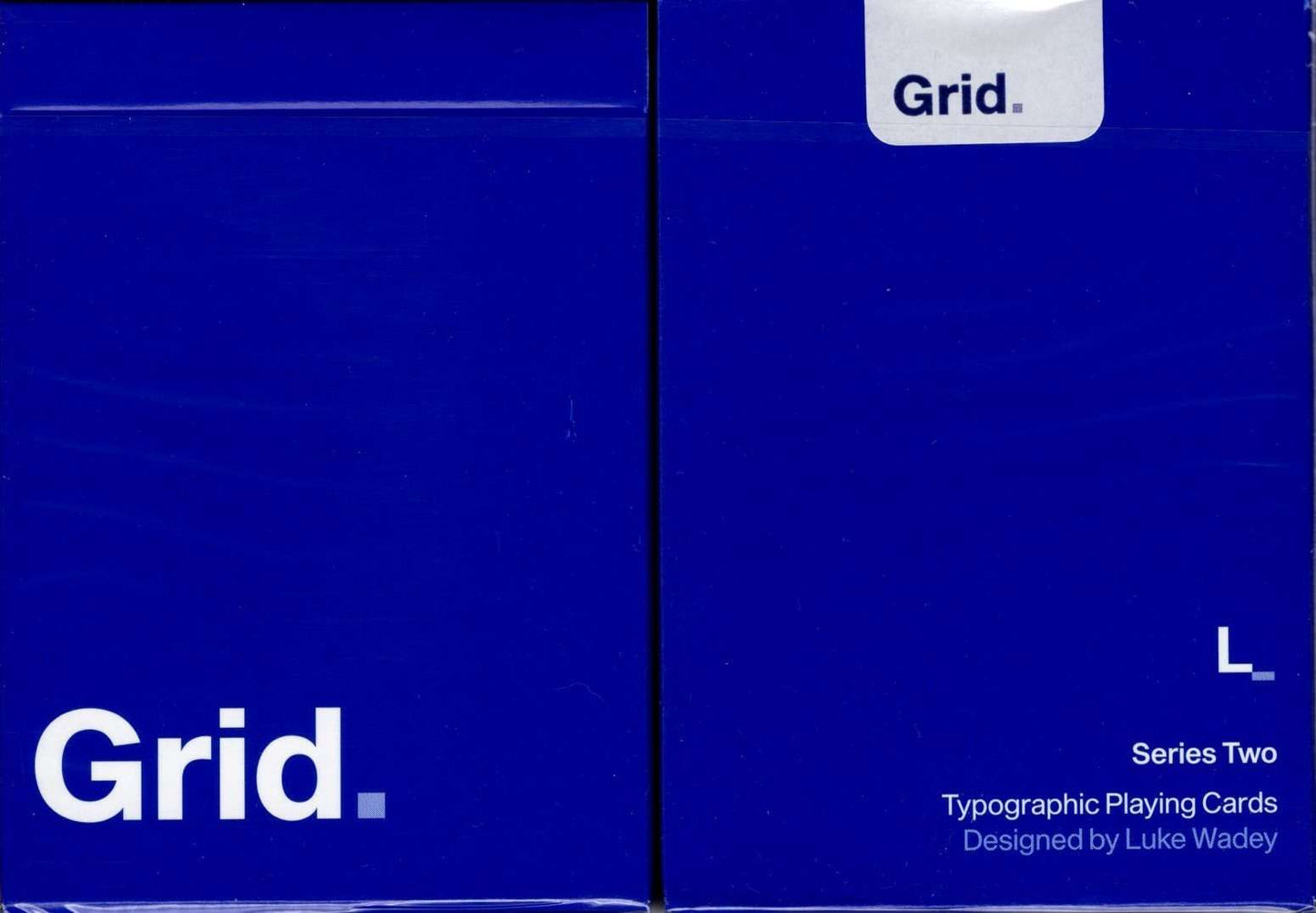
Grid v2 Typographic Playing Cards USPCC
The Grid playing cards are a three part collection based on the design principals of the International Typographic Style, otherwise known as the ‘Swiss Style’ of graphic design. Series Two has been reworked from its original launch because I wanted to refine the design and bring the whole deck closer to the original concept set out by Series One.
Originally starting in the 1920s in Germany, the Netherlands and Russia, the ‘Swiss Style’ later developed in Switzerland in the 1950s. It’s main principals are readability and cleanliness, with most creations adopting an asymmetric layout, always based on the use of a grid. These grids, usually made up of hidden columns and rows, are used to align words, numbers, pictures and patterns and so each series in the Grid collection adopts these principals. The works of designers such as Ernst Keller and Josef-Müller Brockmann have been a real inspiration from a graphic point of view.
The cards are poker size and printed by USPCC but are far from traditional. These cards will be printed on linen, magic air cushion stock which I know first hand really does feel like nothing else with fully customized tuck box and seal.
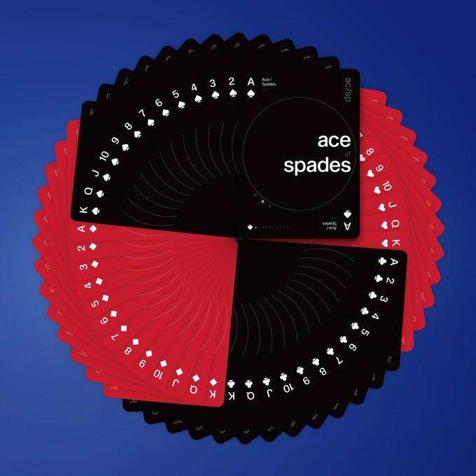
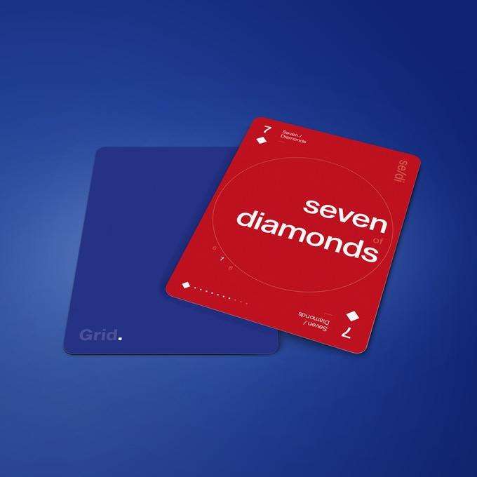
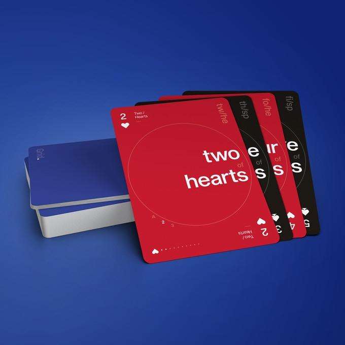
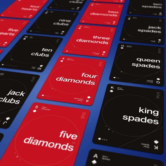
With Grid Series Two, as well as vertical and horizontal alignment like in Grid Series One, I have introduced the circle to create a dial effect and explore how different grids can be adopted on playing cards. Each card has a bespoke set of alignment with the numbers and letters that sit on the edge of the circle so that they visually look to have the same alignment, whilst not always sitting in exactly the same place on each card.
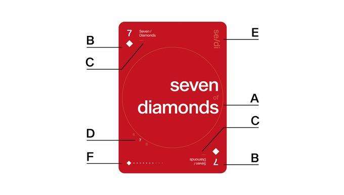
- A) The card is written in it’s full name; seven of diamonds.
- B) Traditional use in the corners with 7 and the diamond pip.
- C) Written with upper and lowercase next to it; Seven / Diamonds.
- D) Around the circle there is the current sequence of cards before and after; 6 7 8.
- E) Short hand code in the upper right corner; se/di
- F) In the lower left corner similar to Grid Series One, the current card is shown by the pip and lit up dots, with ones that don’t apply being faded out for ace to ten, and then switching to diagonal lines for the picture cards; diamond pip with 7 white dots.
Limited edition of 2000 decks.
2018 Release