


Casual v2 Playing Cards USPCC
$9.99 USD
Casual v2 Playing Cards
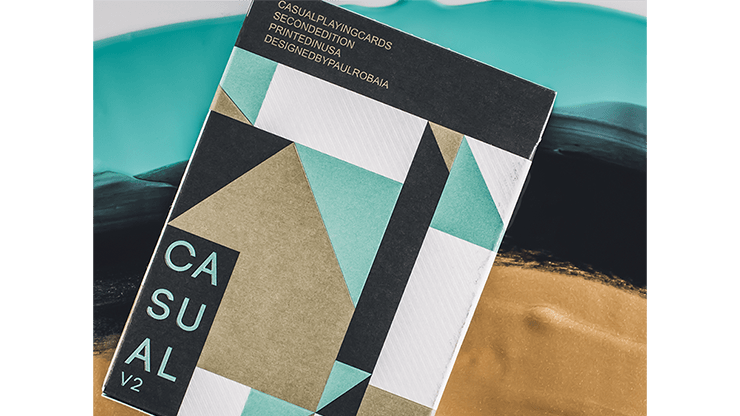
This is the second edition of Casual Playing Cards by Paul Robaia. Printed by The United States Playing Card Company on Air Cushion finish with crushed Bicycle stock.
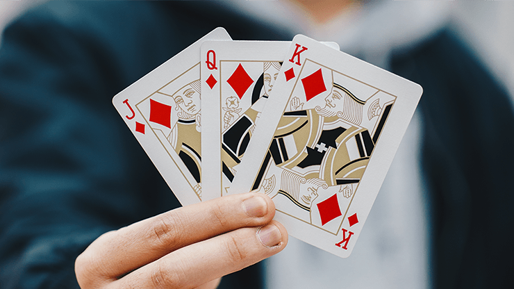
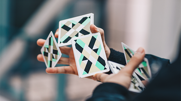
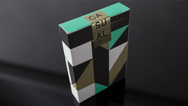
The design, in comparison to the original, has been thoroughly refined. The back sports a clean, geometric pattern with a spectrum of true Pantone and spot colors: mint green, metallic gold, black, and white. The court cards have not only been recolored to compliment the back design but also have been minimalized.
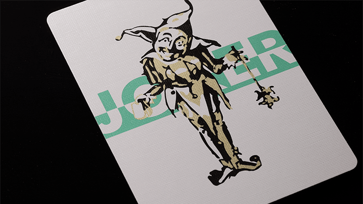
It draws inspiration from the original Smoke and Mirrors court cards. The Ace of Spades is sleek and minimal as well. The Joker pays homage to a classic Joker seen in decks from The Russell, Morgan & Co in the 1800's; however, it, like the courts, has been stripped of excessive detail to promote minimalism.
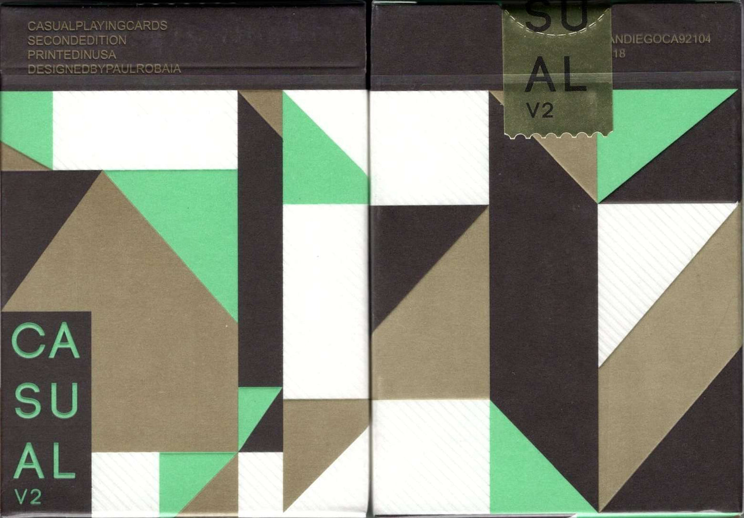
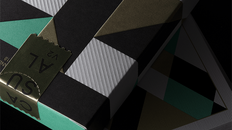
The tuck case has been beautifully handcrafted by Clove Street Press, a San Diego based, letterpress company; there is a sense of dimensionality with certain objects being embossed and others remaining flat. Paul assembled each tuck by hand. Each tuck came flat, as an uncut sheet. He folded and glued each one. He also placed the cards inside each tuck case and wrapped each tuck case using a cello machine that only allowed for one deck to be wrapped at a time. Thus, an immense amount of time and care was put into making this deck of cards.
The design, in comparison to the original, has been thoroughly refined. The back sports a clean, geometric pattern with a spectrum of true Pantone and spot colors: mint green, metallic gold, black, and white. The court cards have not only been recolored to compliment the back design but also have been minimalized.
It draws inspiration from the original Smoke and Mirrors court cards. The Ace of Spades is sleek and minimal as well. The Joker pays homage to a classic Joker seen in decks from The Russell, Morgan & Co in the 1800's; however, it, like the courts, has been stripped of excessive detail to promote minimalism.
The tuck case has been beautifully handcrafted by Clove Street Press, a San Diego based, letterpress company; there is a sense of dimensionality with certain objects being embossed and others remaining flat. Paul assembled each tuck by hand. Each tuck came flat, as an uncut sheet. He folded and glued each one. He also placed the cards inside each tuck case and wrapped each tuck case using a cello machine that only allowed for one deck to be wrapped at a time. Thus, an immense amount of time and care was put into making this deck of cards.
2018 Release