Skip to product information
Sold out

Opulent Luxury Playing Cards USPCC

$11.99 USD
 per 
View full details

Opulent Luxury Playing Cards USPCC

$11.99 USD
 per 

Opulent Luxury Playing Cards

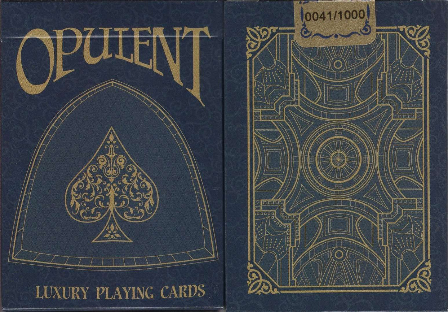
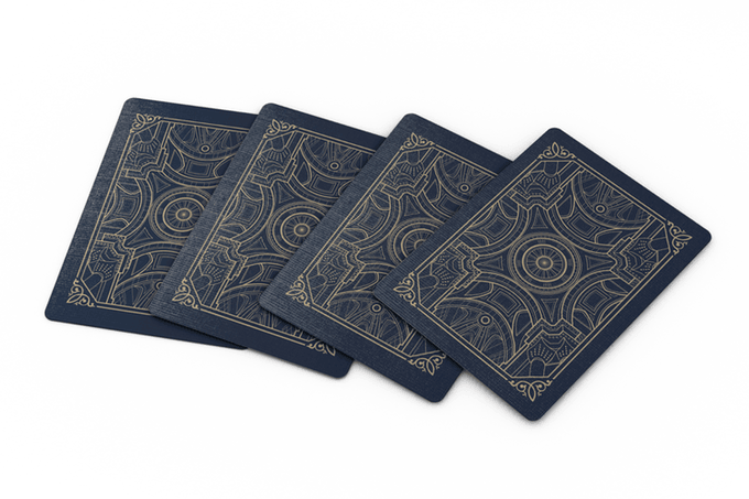
The back of the cards have been based off of a church in Belgium called Dome of St Aubins. The design is of the ceiling of it as if you were standing in the middle and looking up.

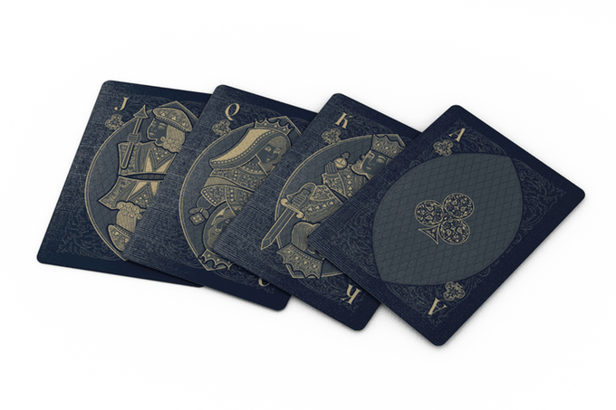
The court cards have been designed with two specific goals in mind. To be original, but easy to recognize. All of the courts are based off of the standard designs, but they have been adjusted slightly to achieve this.

The pips were designed with similar goals in mind to the court cards. Each one is quite exquisite and new, but they are easy for anybody to recognize quickly.

Every card has been crafted with exceptional detail. These one of a kind works of art are an essential addition to any ones collection.  

  • Limited Print Run of 1,000
  • Printed by USPCC
  • Custom Numbered Tuck Seals
  • Classic Stock
  • Poker Size
  • Embossed Finish
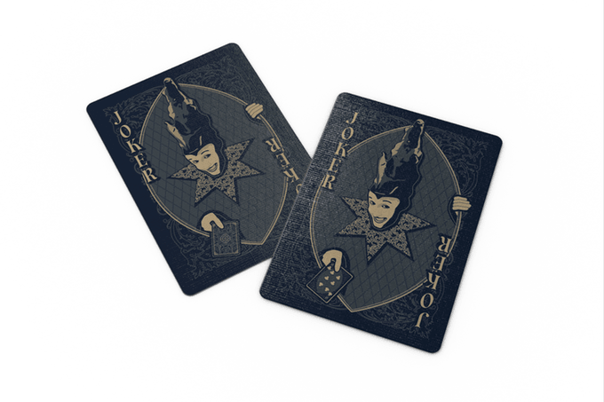
  • Bar Code & Joker Reveal
  • 52 Cards + 2 Jokers & 2 Gaffs
  • 2018 Release

Customer Reviews

Based on 4 reviews
25%
(1)
75%
(3)
0%
(0)
0%
(0)
0%
(0)
T
TiMB
Great deck

This deck deserves a great review. Well done. The color is very deep and a good choice for the style of the deck.

D
Daniel Costarell
A hallowed deck

I always enjoy a deck with a nice theme. These cards feature the same coloration thru the deck on both the front and back, with a gold colored ink on a dark blue background taking the lead. The back design is that sort of "church ceiling" symmetrical design, as if you're standing inside an old basilica and looking straight up at the ceiling. This design lends itself to having a very renaissance type of feel, and that theme continues on the card fronts. Each and every card in the deck is custom, with dark blues at the corners of the cards and a slightly lighter shade for visibility at the center of the card. There is some leaf type scrollwork design on the background of the darker portion, and crosshatching on the background of the lighter center. All of the fonts and pips are completely custom. The court cards receive a nice makeover from their standard look, bearing more renaissance style attire. All aces have a nicely adorned center pip. Two full sized jokers are included, and while the design of the joker is not my favorite, I do love that the jokers are identical EXCEPT for the fact that there is a reveal with the jokers, as one holds a card face down, and the other holds a six of clubs face up. Also included is a double backer and a jack of hearts to three of clubs gaff card. Although I don't prefer the ink being exactly the same (no color difference between hearts, diamonds, clubs, and spades), it works for this deck, and there is little to criticize here.

S
Steve Hansen
My opinion

Very neat deck but the use of one color for all the card suits makes it difficult to distinguish one from another. Nice court card artwork. 4 1/2

E
EndersGame
An extravagant deck for collectors

The word opulent is synonymous with extravagant, which epitomizes what creator George Williamson and artist Jennifer Bennett wanted to pack into this creative deck.

Our admiration begins with the luxurious looking tuck box, which features the gold and blue colours that are synonymous with this deck, and has an individually numbered seal.

The design of the exquisite card backs is based on the interior ceiling design of a church in Belgium.

The courts are based on traditional designs, but have a very original look with ornate details and lavish artwork that adds to the overall feel of opulence that this deck evokes. The overall look conveys the sense of an exquisitely crafted woodcut. Despite the extravagant detail, the lines are bold and the shapes are clear, so there is an immediate sense of the familiar. The Aces all have highly detailed and oversized pips.

All the cards are framed with a highly patterned background, while an oval panel in ensures that the decorative pips stand out in sharp relief. The indices continue the theme of sophisticated detail combined with practical clarity, and are immediately recognizable. Using a single colour for all the suits is a good choice artistically, but does make the red/black suits more difficult to distinguish.

USPCC production has ensured consistent printing and nicely embossed cards that handle smoothly. - BoardGameGeek reviewer EndersGame

Recently viewed products